If you keep up with trends, you’ve no doubt noticed that pastel pink has been everywhere for the past few years. And everywhere is no exaggeration: From national ad campaigns and cosmetics packaging to red-carpet gowns and entire restaurants, the prevalence of the hue is indisputable. Many have dubbed the shade “millennial pink,” referencing its popularity among younger-skewing consumers.
But despite its trendiness in fashion and pop culture as a whole, we think it makes the perfect accent color for the home—and not just in unabashedly feminine spaces. Here, we’ve rounded up some of our favorite ways to use the hue, including in a distinctly masculine setting and as a neutral, proving it’s more than just a focal point in sugar-sweet interiors.

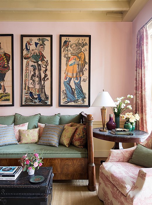
A Match for Masculine
The look: It’s true: Pink can work in spaces with a more masculine feel. Here, it’s a subtle contrast to handsome vintage pieces, balancing out the heaviness of the wood for a lightened-up look that doesn’t veer feminine in the slightest.
Why it works: The key to making pink work in this space is all about choosing the right hue. And in a space that strikes a delicate masculine-feminine balance, subtlety is of utmost importance. The pale pink wall provides a warm, almost-neutral backdrop to the space while also running a common thread through the blush shades in the artwork, the red upholstery of the curtains and the armchair, and the pastel tones of the throw pillows.

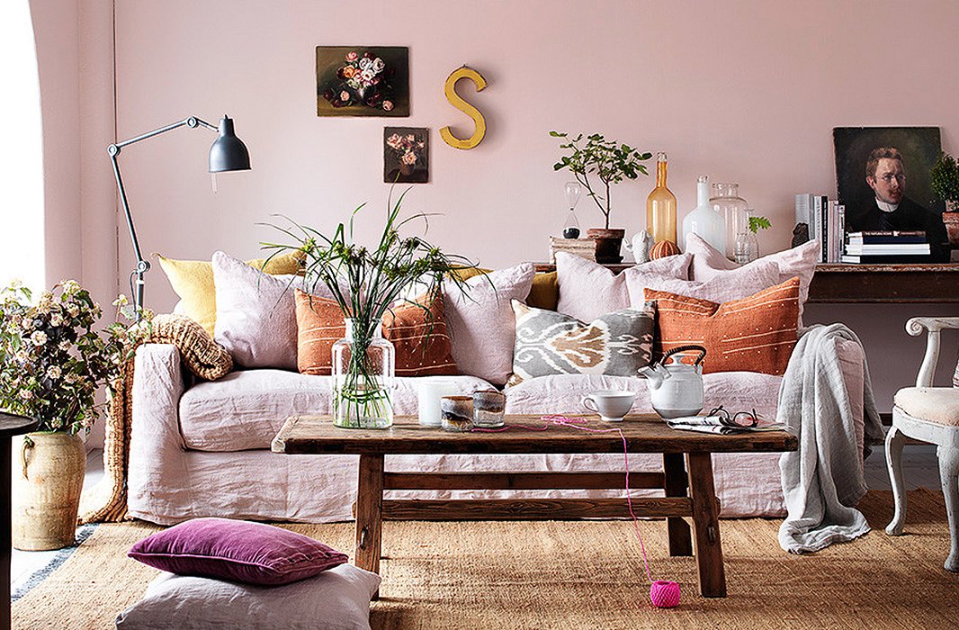
The Boho-Chic Layer
The look: Pastel pinks, plants in glassware, well-worn woods, tons of layers: It’s the stuff our Instagram feeds are practically made of. It’s a soft, soothing combination that feels utterly warm and approachable, and, despite its rampant use of pink, doesn’t veer too far feminine.
Why it works: It’s all about creating a lush look with layers, but one that doesn’t feel over the top. With its ample decorative pillows and cozy throws and its collected mix of glassware, art, and lighting placed at varying heights, this space could easily descend into cluttered chaos. But the calming presence of the pastel pinks grounds it all.

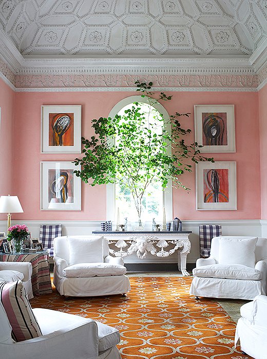
The Color Tie That Binds
The look: Depending on how you use it, nearly any shade can be a neutral. This is evidenced here, where the bright salmon pink of the walls acts to unite a diverse palette of colors, creating a cohesive look that feels at once classic and fresh.
Why it works: Navy checked chairs, a bright orange rug, warm-hued abstract art, classic stripes: It might seem like a tall task to find a color to complement—and bring together—this cornucopia of shades and prints. But pink is a natural choice, contrasting against the navy and orange while tying into the striped upholstery and artwork.

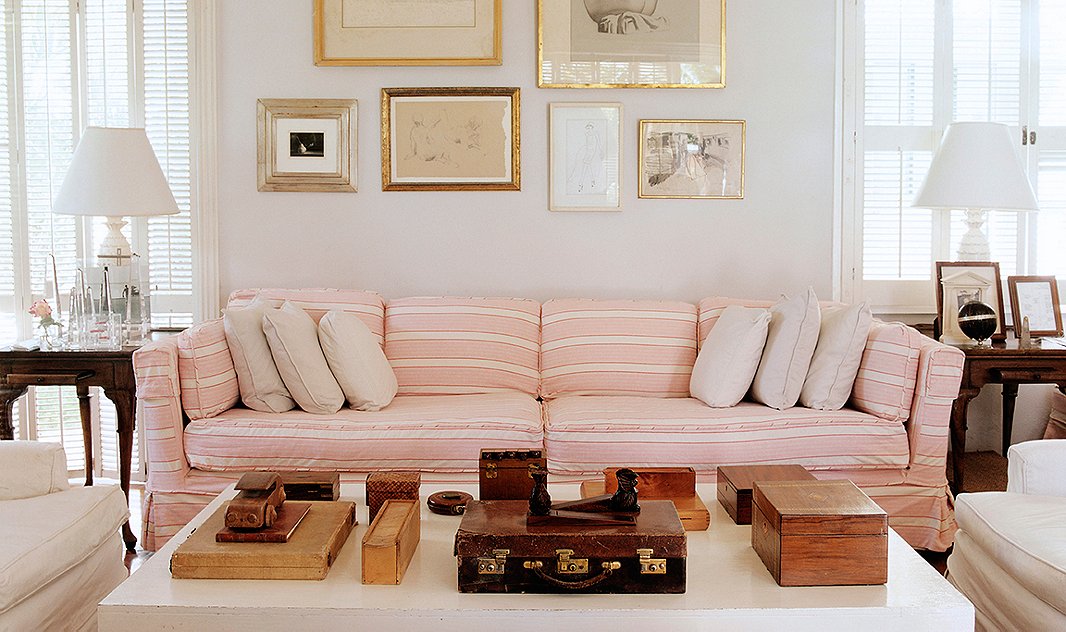
The Sumptuous Yet Subtle Pop
The look: It’s not often that you see a pink sofa, and certainly not in a setting like this. Most pink sofas are velvet, which makes this laid-back version all the more distinctive. We love the fresh, modern vibe it brings to this collection of crisp accents and vintage finds.
Why it works: Alongside antique woods, neutral art, and plenty of white details, the sofa provides a soft, and welcome, pop of color. The stripes contribute a patterned punch, adding subtle graphic interest while still playing into the cool and calming feeling.
Original article and pictures take blog.onekingslane.com site
Комментариев нет:
Отправить комментарий